Step-by-step: “Old Friends”
Posted on: Jun 25, 2013
This spring, I gave a private lesson to a local artist friend of mine. We set up our easels side by side, and I did my best to explain my process as we each worked to capture this still life arrangement in oils. Once it was over, I had already invested so much energy in describing my painting choices that it seemed like a natural opportunity for a step-by-step writeup.
The Concept
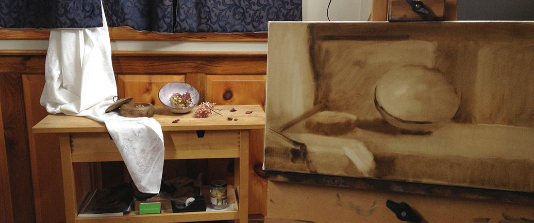
Arranging still lifes can be a real challenge, and this challenge is magnified when a painting’s primary purpose is to be a vehicle for instruction … and only secondly a “work of art”. In this case, cramming two artists and two easels into my tiny studio left little room to play around with subject matter, lighting, and arrangement. But restrictions can also save us from the paralysis of choice – when we are left with few options, we have no choice but to make the best of what we have and then get on with it.
I came to terms with this particular setup by the simple fact that every item in the arrangement is somehow a favorite of mine – hence the title, “Old Friends”. My hope was that the viewer (or eventual owner) of the painting would feel the same sense of peace from being surrounded by these objects as I do.
Layer 1: Underpainting
I have three basic methods of starting a painting:
- If a painting is large enough or complex enough to warrant it, I will do a full-scale line drawing in graphite or charcoal on paper, which I then transfer to the final canvas before using any paint at all.
- If a painting is small or simple enough, I will dive straight in with color on the final canvas.
- For almost everything in between, I begin with a monochromatic underpainting, which I paint overtop of with color after it has dried. This is what I did here.
The plan was to develop the painting in four layers, letting the paint dry to the touch between each layer: Underpainting – Color Lay-in – Rendering – Finishing Touches.
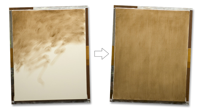
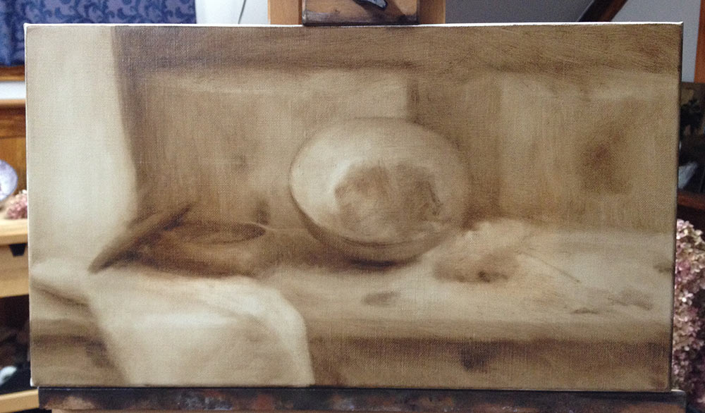
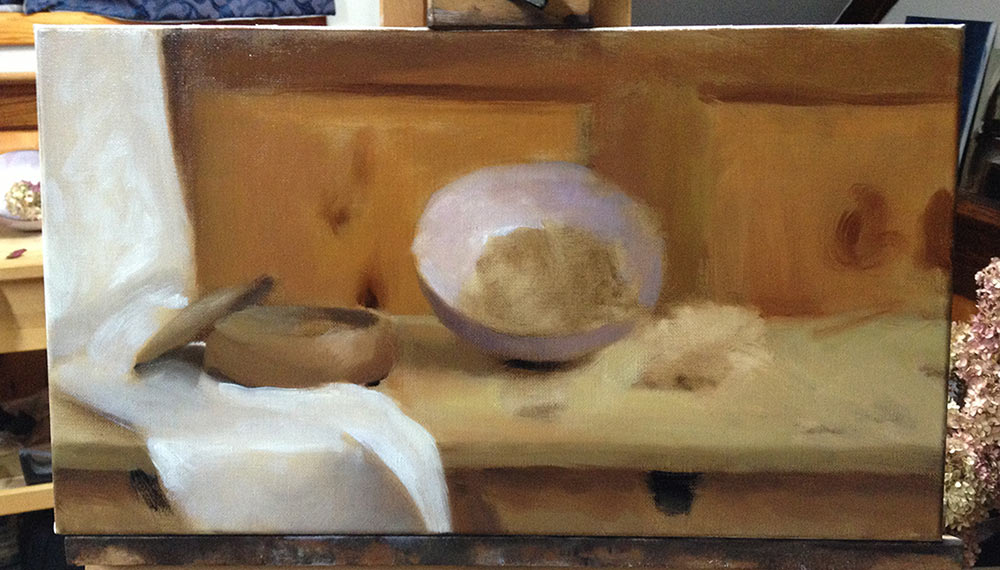
The purpose of the underpainting stage is to develop a monochromatic rendering that will serve as a guide for subsequent layers of color. First, I rub a thin layer of cold-pressed linseed oil across the entire canvas. Then I brush on a thin coat of raw umber paint until the canvas is tinted a light middle value.
The underpainting is developed by brushing on more paint for the dark areas and wiping away with a rag for the lights (so that the white of the canvas shows through). The paint stays wet for about six hours, although this can be altered by adding more or less oil – or by using turpentine instead of oil if you really want the paint to dry fast.
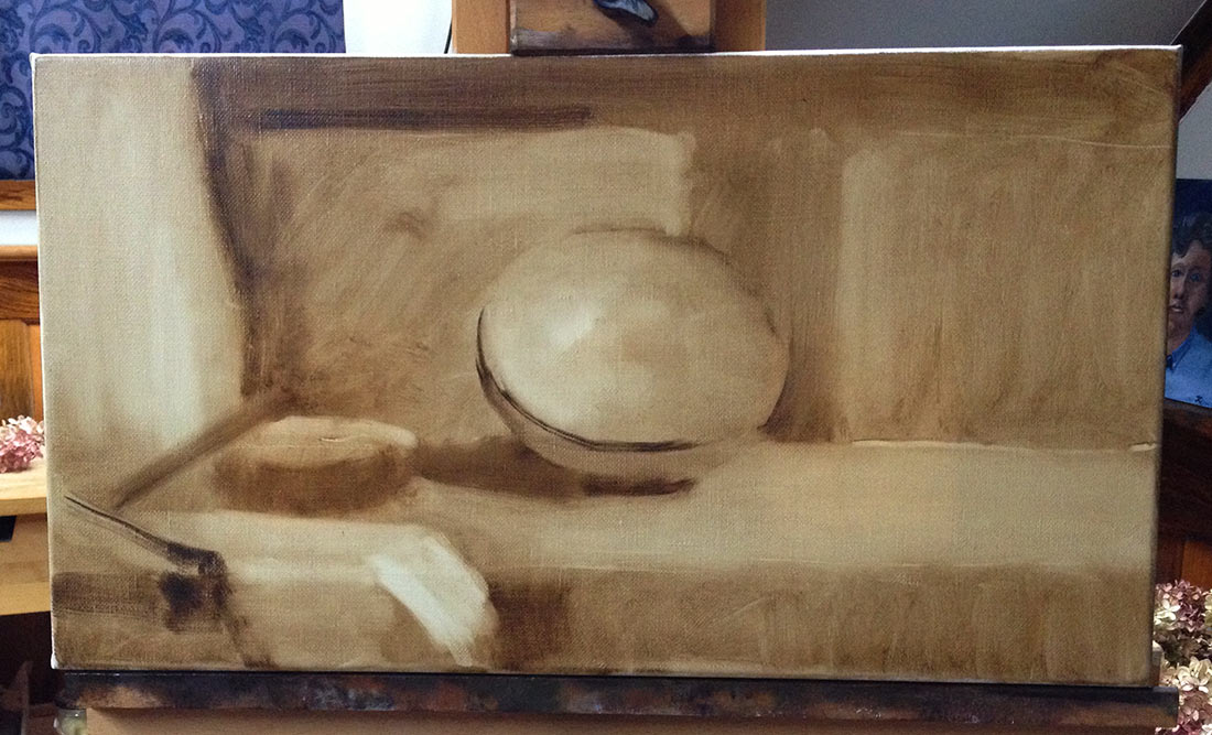
When working this way, I do almost no line drawing. Instead, I work with shape and value simultaneously, pushing around blocks of tone until I think they are reasonably placed. This can be a little sloppy, but it is the fastest way I know of developing a fully tonal image on canvas (the photo above represents about 20 minutes of work).
Monochromatic oil washes are ideal for this process, because your work can be wiped out and repainted indefinitely while the paint is wet (as opposed to graphite or charcoal, where a certain amount of erasing will begin to damage your paper). A viewfinder set to the same proportions as my canvas helps me choose a composition and lay in my initial shapes with a minimum of guesswork.
In the image above, I have all of my major shapes defined. The hydrangea blossoms are a little amorphous, so I haven’t included them yet, but the bowls, tabletop, cloth, and panelling are all made up of simple shapes with definite edges that I can judge my proportions against.
In this process, I am consciously trying to avoid detail as I strive to place my basic shapes correctly within the overal pattern of values in the picture. I will continue to model the forms of both of the bowls as I go, but only in conjuntion with correcting or refining their basic shapes.
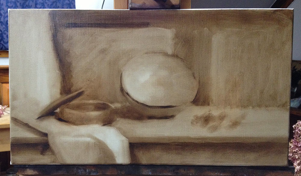
After about three hours’ work, I have produced a simplified, out-of-focus, but believably three-dimensional scene, and I am confident that I can stop. But before I leave the painting to dry, I gently wipe down the whole canvas with a rag, taking particular care to remove the darkest darks, the hardest edges, and any excess oil. It takes a bit of will power to undo a lot of my hard work, but it makes all the steps that follow easier. No matter how accurate I think an underpainting is, I always come back to find that my “drawing” needs quite a bit of adjustment in subsequent layers! Here is the wiped-down underpainting, as I left it to dry:
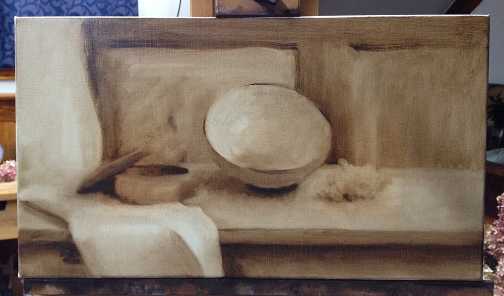
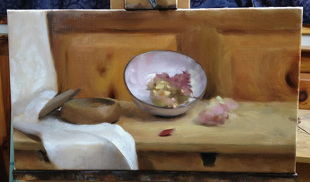
Layer 2: Color Lay-in
The first layer of color is another foundation layer – I am still working mostly out-of-focus in order to set myself up for the next layer of paint. I am not trying to create a finished rendering at this stage.
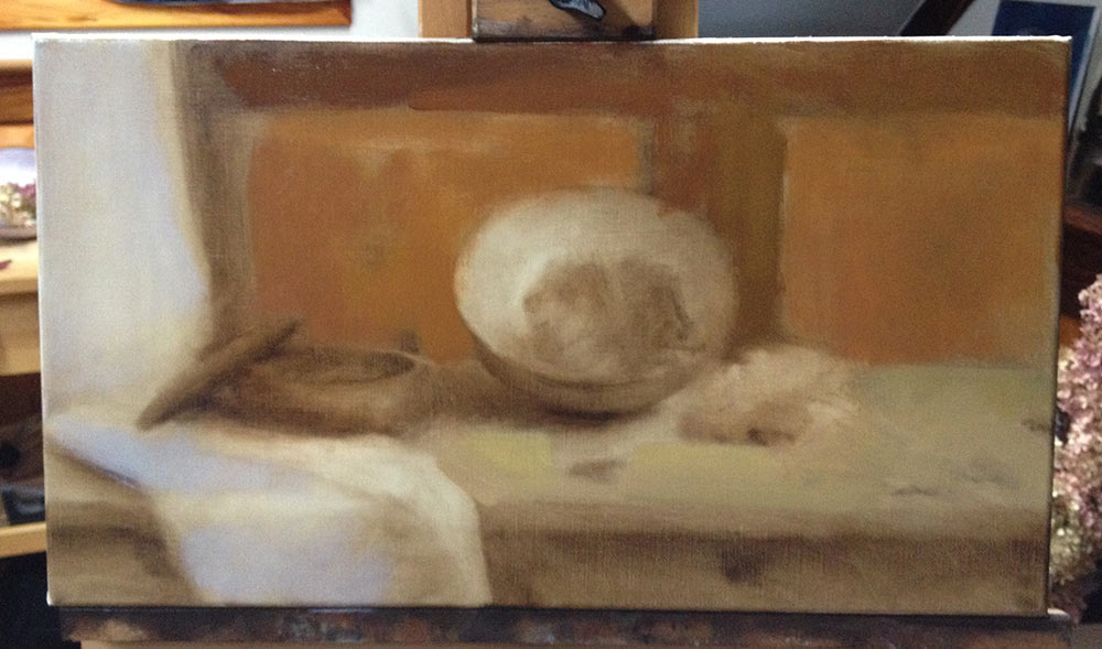
Covering the brown of the underpainting is always a bit of a shock, because it throws off my perception of my initial color choices. In the image above, the color that I’ve laid down in the forground of the white cloth looks almost purple, which was not the case when I was mixing it on my palette. For this reason, I try to cover the largest, most obvious areas in my paintings first, so that I can get my bearings as quickly as possible.
Also notice how quickly I have defined my lightest lights and darkest darks. I try to do this as soon as possible, to give myself anchor points around which I can define a full range of values. If I know I will be painting something with a glob of pure white – in this case the highlight on the ceramic bowl and the foremost fold of cloth – then I will put down a little bit of white paint right away, to give me something to judge the rest of my values against.
Having said that, there is a perfectly valid opposing philosophy of saving the most extreme values for the end of the painting process, so that you always have the option of pushing your values a little further in either direction. As always, the trick is to learn what is possible and pick the approach that best suits your own personal temperament.
It may not be obvious here, but I am very conscious of my edges as I develop this layer. Just as I have defined my lightest lights and darkest darks, I want to identify what the hardest and softest edges in the painting will be. But there are two additional considerations:
- This is only the first layer of color, so I don’t want to define anything too sharply unless I am absolutely sure of its placement. The last thing I want is to have to cover up an ill-considered glob of paint after it has dried.
- Identifying the sharpest edges in my pictures tends to be a more subjective process than identifying key values. Here’s why:
When I look at my still life arrangement, I can see the edges of almost every object in perfect clarity – but not all at the same time. If I focus on one object, then another one becomes blurry, and vice versa. Therefore, I try to resist the urge to crisply define every edge in the painting. I generally reserve my hardest edges for three purposes:
- To emphasize the importance of something in the picture (“Look at me! I’m razor-sharp!”)
- To help define the material nature of an object (razor-sharp razor is painted razor-sharp)
- To ehance the impression of depth within the picture (hard edges come forward; soft edges recede)
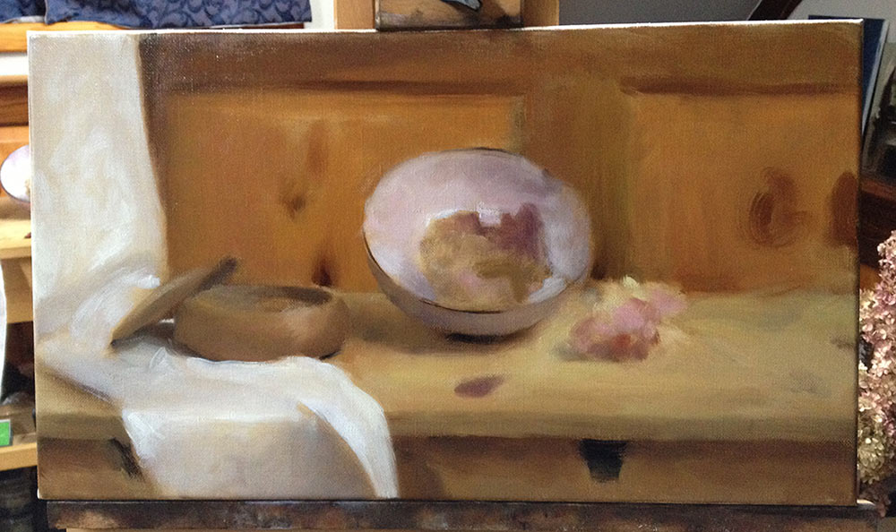
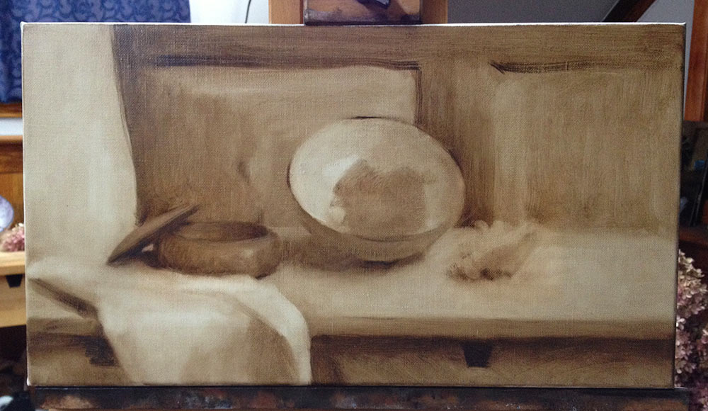
As I develop the larger forms in the picture, I am also thinking hard about all the details that I haven’t painted yet. For instance, in the images above you can see two knots in the wood panelling on our right. There should only be one knot, but I can’t decide where I want to put it … so I worked for awhile with those two splotches sitting on the canvas while I developed the rest of the picture. I eventually decided in favor of cropping the knot, as you can see in the image below:
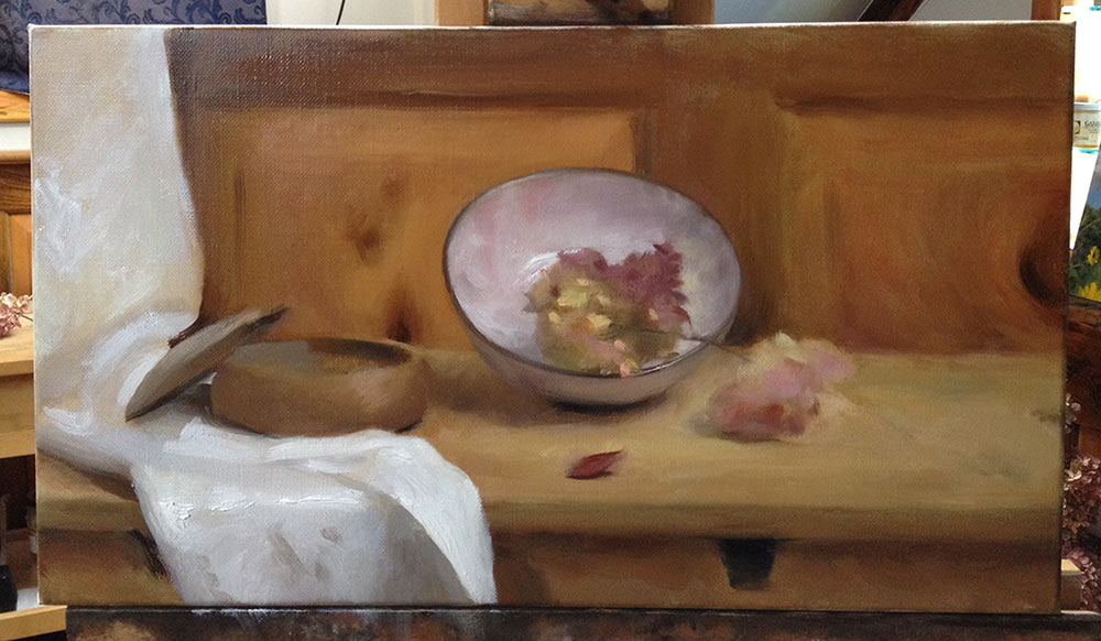
After about three hours of work, this is how I left my color lay-in to dry (for one week). Notice that the hydrangea blossoms remain vague scribbles, while their stems and the stray dried rose petals are barely even indicated at all. For me, these elements all lend themselves to being painted in “one shot”, so I am holding off on them until this layer has dried.
Layer 3: Rendering
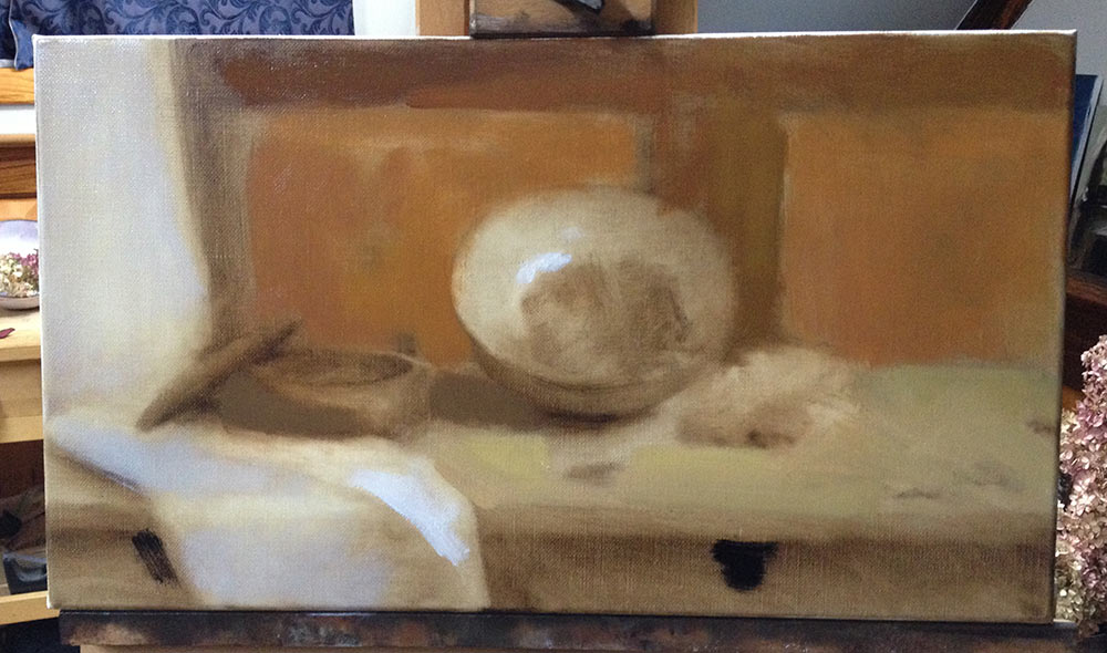
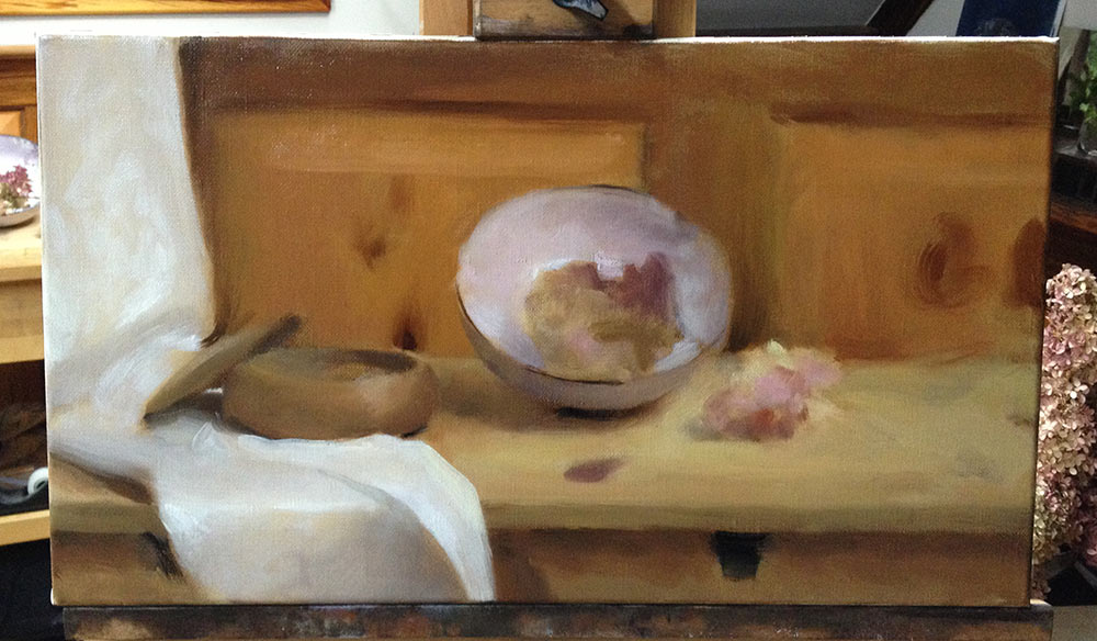
At this point, I should have a full-value, full-color painting with all of the major shapes in place. The rendering layer is where I model the forms of the individual elements within the picture, bringing them to full clarity and contrast. I am finally “playing for keeps” – the brushstrokes that I put down, if successful, will remain as they are in the finished painting.
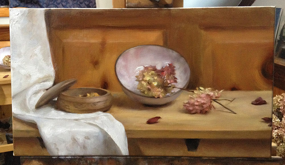
Until now, I have been working “outside in”, from big to small. But I start this layer right in the center of the picture, on the pink bowl and hydrangea blossom. (Actually, I’m still working outside in, just on a smaller scale – from the edges of the bowl into the hydrangea in the center). I expect this area to be the primary focal point of the picture, and I want to set a new level of finish here before I continue to develop the rest of the painting.
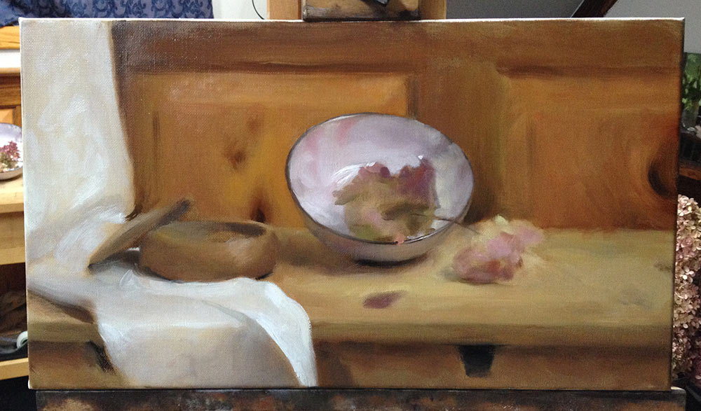
With the pink bowl accounted for, I begin to give serious attention to the wooden bowl and the white cloth. I begin by restating the basic shapes in broad strokes, which quickly get refined:
At this point (above), the left half of the picture looks to me like it could be finished, so it is finally time to tackle the finicky bits on the right half. The detail below shows my initial strokes that begin to define the hydrangea stems:
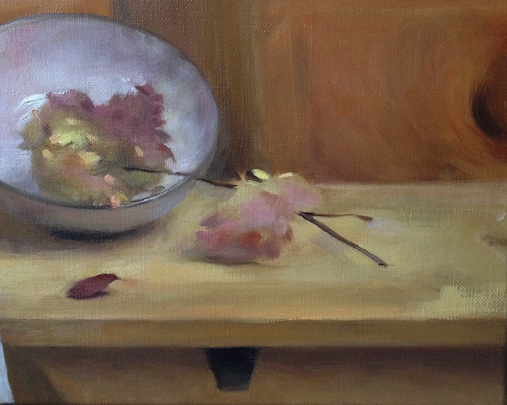
Unfortunately, I don’t have process shots from painting the smaller hydrangea blossom and the rose petals. But you can see how my final composition evolved along the right-hand side of the canvas between my original underpainting and finished rendering:
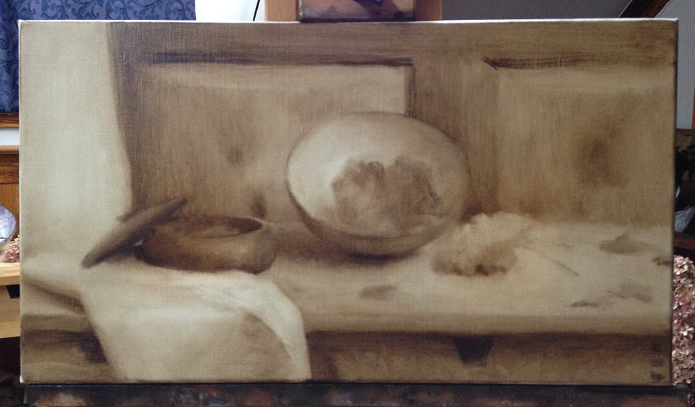
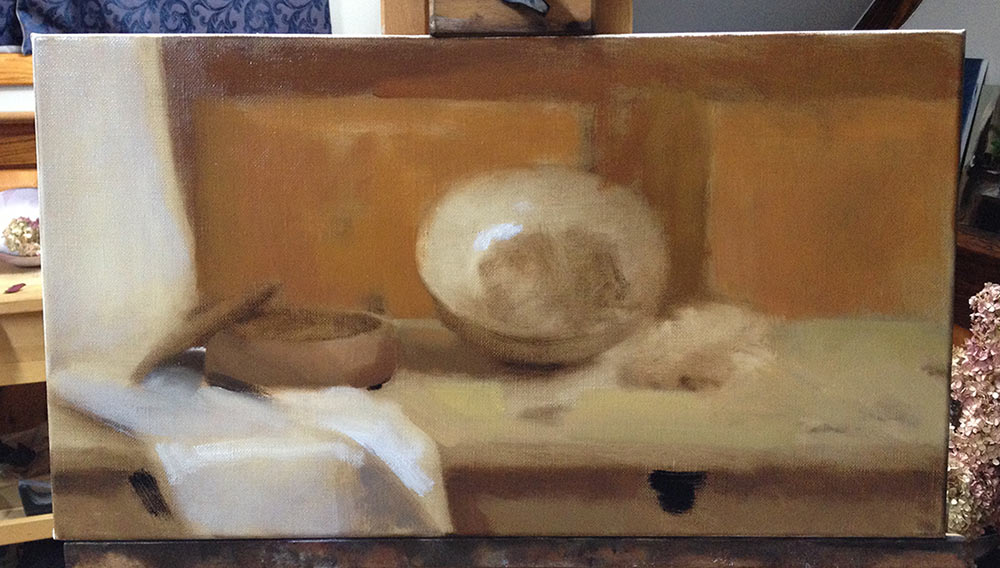
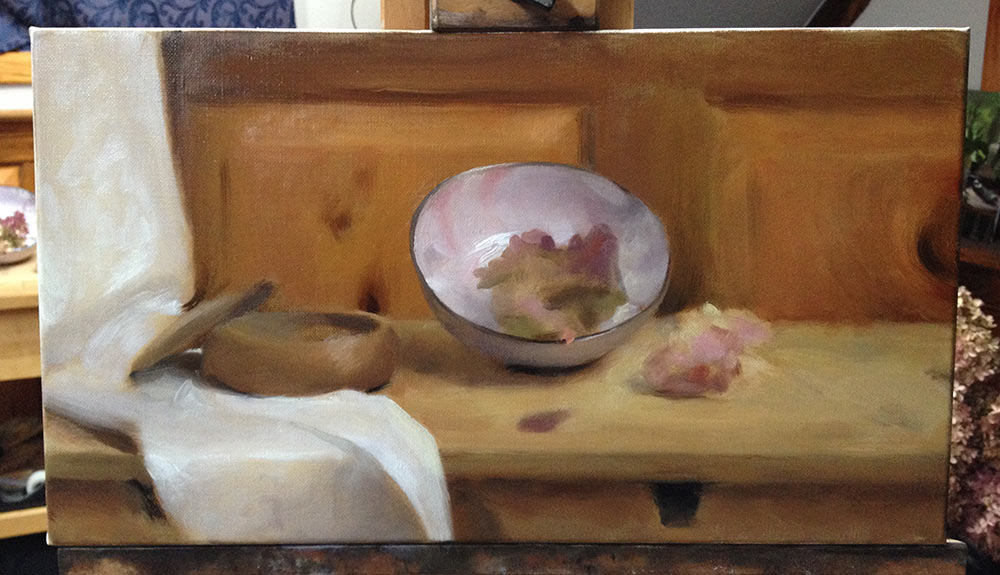
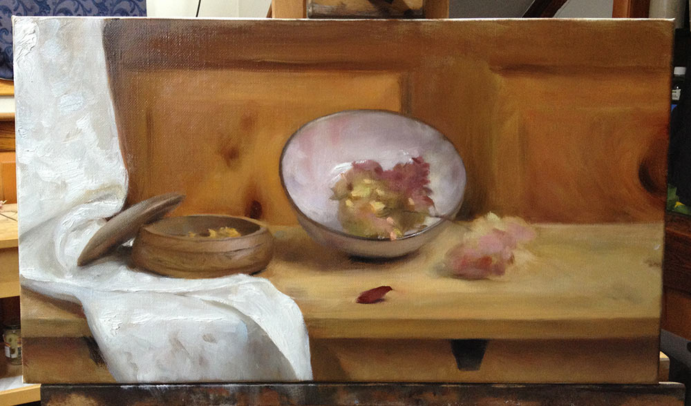
The above photo is how I left this layer to dry after about ten hours of work – thinking that it looked finished, but knowing that I would be back for a final round of touchups.
Layer 4: Finishing Touches
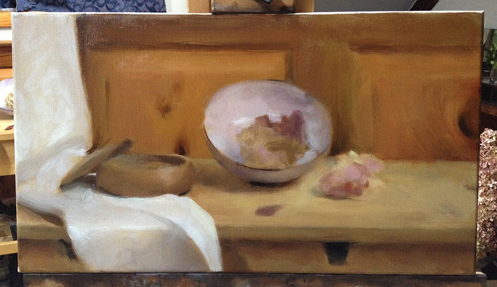
After letting the painting dry for several weeks, I brushed on a thin coat of retouching varnish and applied whatever subtle touchups I felt were necessary. These adjustments were mostly too subtle to point them out specifically, but I think it’s noteworthy how much there is to see when I come back with fresh eyes to a painting that I thought was completely finished. I have heard so many artists emphasize the need to “stop painting before you ruin it”, and I want to speak up for the other side of the coin!
I worked for almost four hours – restating my strongest highlights, softening some edges and sharpening others, adjusting the rims of both bowls, smoothing various color transitions throughout the painting, and finally signing it.
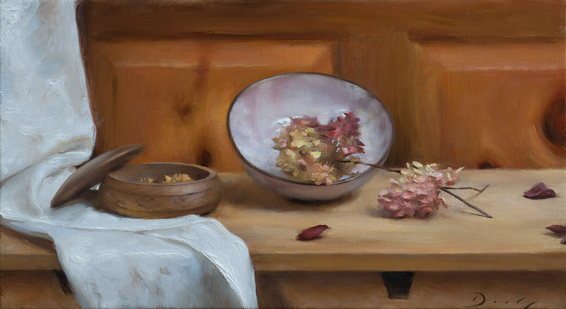
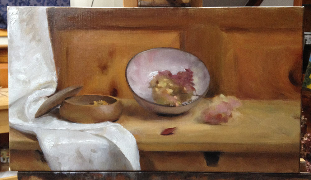
Here is the finished painting – “Old Friends”, oil on linen, 18”x10”:
Up Close: A Study in White
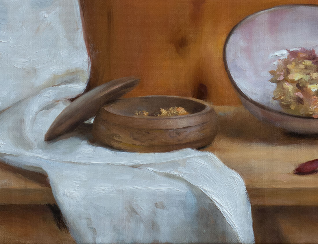
The above detail shows that I leaned heavily on the use of pure white in the cloth. Nevertheless, the foremost fold of cloth and the highlight within the pink bowl read as the brightest highlights in the painting, because they were painted with several layers of thick impasto. Also, the thickness of the highlight on the foremost fold of cloth pushes it further forward (literally) in three-dimensional space than the rest of the cloth, which enhances the illusion of depth in the painting.
When developing the value pattern of a painting, the theoretical ideal is to identify one “lightest light” and one “darkest dark” in the composition, and to reserve pure white and pure black* for those areas only. This preserves a clear structure of values within the “world” that your canvas implies, which viewers will appreciate even if they are not conscious of it.
* Obviously, not all subject matter affords opportunities for pure white or black paint. The use of black is also a source of controversy among artists that I don’t want to address here…
However, it is important to remember that oil paint is not entirely opaque, so that pure white is not necessarily PURE WHITE … especially if you are working in layers over a toned canvas. In my experience, the following gradation comes into play:
- An undiluted brush stroke of pure white, painted overtop of a toned canvas or underpainting = White
- A second pure white brush stroke, laid overtop of the previous stroke after it has dried = Whiter
- A thick glob of pure white, laid overtop of the previous stroke = Whitest
In reality, the second brushstroke will be the same value as the glob of paint, but the glob of paint will “read” as brighter, because it actually projects out from the surface of the canvas and picks up more light than the rest of the painting. Because it is three-dimensional in and of itself, the glob of white will pick up its own real-life highlight.
Unfortunately, I’m not sure if this all comes across in the photo. There are so many reasons why paintings are better viewed in person, but the blessings and curses of photography are a whole other story…
![]()