Step-by-step: “White Rose”
Posted on: Feb 22, 2011
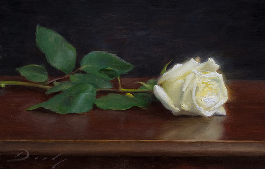
For the most part, I have two gears as a painter – one for paintings that I build up wet-over-dry, letting each layer dry for days or weeks between coats … and one for smaller paintings that can be completed in one or two sittings while the paint is still wet. This little picture is a good example of the latter – 12″ x 8″ and completed over the course of a long day.
Preparations

I begin every picture that I paint from life by looking through an adjustable viewfinder. This one is made by Viewcatcher, and I like everything about it except how small it is. This company also offers a Viewcatcher iPhone App, which I haven’t tried. With the viewfinder taped in place at the same dimensions as my canvas or board, I can easily find a composition that is actually capable of fitting within these dimensions. In this demo I looked through the viewfinder quite often through Steps 1-3, after which I put it aside entirely.
Also, unless I intend to begin with a sepia underpainting, I always paint overtop of a lightly toned canvas. I use either straight Raw Umber, scrubbed on very thinly, or Raw Umber mixed with Ultramarine Blue if I want a grayer tone. I have seen many artists begin their paintings with a quick turpentine wash which they work right overtop of while wet, but I prefer to let my ground dry for at least a week before painting over it (when time allows). You can see my ground still showing through in the photo below.
Step 1

I rarely do any serious drawing with paint, as you can see above. When I do feel the need to have a line drawing in place, I will do it in pencil or charcoal on a separate sheet of paper and trace it onto my canvas … but for a little painting like this, a preliminary drawing isn’t necessary. I begin very slowly – it took me about a half hour to block in these shapes, and I can spend much longer if the composition is complicated or I am having a bad day! The idea is to be as accurate as possible before even thinking about rendering anything, so that I don’t end up having to move the rose blossom half an inch one way or the other after I’ve spent the whole day modeling details.
Step 2

Starting to block in the leaves. Everything except the rose blossom is scrubbed or laid on thinly, using straight cold-pressed linseed oil as a medium. This way I can easily wipe things out with a rag if I need to move any shapes around. At this early stage, I try very hard not to put “good paint over bad” – if I think something is wrong, I will wipe it away before repainting it.
The rose blossom is painted without any medium, since I know I will be piling on paint here by the end of the day – I don’t want this area to be slippery. At this point, I am using mainly pure white, or white with a little Naples Yellow Light, so that this area doesn’t become contaminated with stray colors while I am still tentative about it’s placement.
Step 3

Continuing to block in leaves, and starting to define the blossom. Notice that I am caricaturing the form at this point: the background, tabletop, and leaves are each painted with just one or two colors/values, and even the blossom is still mostly just white with a few hesitant halftones. All it takes is some punctuation shadows under the rose and a simple reflection on the table, and the whole picture looks three-dimensional.
Step 4

Here I am refining the leaves, and giving the background and foreground some attention so that the rose is anchored in space. Notice how hard-edged the little punctuation shadows are against the undersides of the blossom, leaves, and stem … and how soft these same shadows are against the tabletop. This contrast is crucial to the success of the painting. The edges of cast shadows are nearly always softer than the edges of the objects that are casting them … and this is especially true when lit with a north window and soft fluorescent lights, as in this scene.
At this point I am convinced that my drawing (meaning my placement of shapes) is accurate enough not to cause problems later on, and I am happy with my composition. I will occasionally reach this stage in a painting and wipe everything out completely & start over – in the long run, one can save quite a bit of frustration by NOT trying to finesse a mediocre foundation into a finished piece! Thankfully this painting turned out to be a fairly straight shot from start to finish :)
Step 5

Confident in my preliminary work, I am beginning to render the rose blossom in earnest. This is a significant step for the painting – if I can paint the blossom successfully, everything else should happily fall into place around it.
In order to model a white rose in only one layer of paint, I have to lay it on pretty thick. Since oil paint is somewhat translucent, my umber ground always wants to show through … so there is actually a pretty significant difference in appearance between a patch of pure white painted sparingly next to a patch of pure white gobbed on (the gobbed-on white is much whiter) … and I try my best to take advantage of this rather than be annoyed by it. I am using Michael Harding’s “Foundation White” – a 50/50 mixture of lead and titanium that I find to be a nice balance between covering power (titanium) and luminosity (lead).
Step 6

Having brought the blossom to a new level, I start detailing the leaves and stem, and I paint the background and table in earnest. Until this step I have mostly used just one color mixture for the background, achieving variation by letting bits of my umber ground show through … but now I am throwing in subtly complementary colors and covering up my initial undertone. Many contemporary painters will artfully and deliberately let areas of their ground show through in their finished paintings. It can be a beautiful effect, but I rarely seem to get away with it and prefer to achieve variation more opaquely.
The bottom line is that the background needs to have a sort of shimmery quality in order to look believable and remain in harmony with the rest of the picture. If I painted it very smoothly and uniformly, I would actually be implying that the whole picture should be painted in an incredibly precise, detailed manner (which is not my intention). By keeping the background somewhat scuffed up, it makes the things I actually want to emphasize appear cleaner.
Step 7

With the rose accounted for, I start to render the front edge of the table. Now the degree of finish of the painting’s elements is basically in balance again (like at the end of step 4) … but the painting is not quite done. From here on out I will selectively render details and play with my edges to subtly push and pull different elements of the painting forward or backward in space.
I have been working for almost eight hours at this point, and it is dark outside, leaving only my studio fluorescents to light the subject. If this was a problem, I could stop working and finish up the next day – the paint would still be wet, and the rose seems to be holding up well. However, in this case the change in light is subtle, and I don’t mind the effect – mostly just deepening the shadows a bit. I am also in a happy, peaceful rhythm, so I opt for a late night of finishing touches.
Step 8

Now I refine the leaves, play with my brushstrokes in the background, and continue to render the front edge of the table. Notice how much more distinctly the front edge is painted than the back edge. With so few elements in this painting, there is not much here to demonstrate that the space is three dimensional. The closest thing to an object “in the distance” is the rear edge of the table – if this painting were a landscape, that rear edge would be my horizon line, way off where the sea meets the sky. So I deliberately paint this edge as indistinctly as possible, so long as it still “reads” as the edge of a table. I especially soften and break up this edge where it runs behind the rose – this helps to push the far end of the table into the background and pull the rose out toward the viewer.
Finishing Touches

It may not be obvious from these web photos what exactly happened during this last step, but this final stage actually represents at least two hours of tinkering. The goal is to create a subtle but clear hierarchy of values, edges, and colors, so that the “right” elements command attention while others recede. “Right” is based on a combination of three things:
- What I actually see
- What is in front of or behind what in space
- What I deem to be the major and minor focal points of the painting
In this case, #1 and #3 are completely in accord: the rose blossom is the brightest element in an otherwise dark painting, and it just so happens to be the “star” of my production :)
The sharpest edges have been reserved for the punctuation shadows under the blossom and frontal leaves, which are the furthest forward focal elements in the painting. The front edge of the table is further forward but not as important pictorially as the rose itself, so its edge is kept slightly ragged compared to how clean and sharp it actually appeared in real life. (A lot of this sort of thing is done unconsciously as I work … but to the degree that I am thinking at all, these are the things that I think about).
Meanwhile, I subdued some of the brushstrokes in the background, and I darkened it around the edges of the picture, helping focus the viewer’s eye in the center of the painting. This is the only significant departure from reality in the painting – I omitted any folds from the sheet, and ended up creating my own tonal shift based on what I felt best complimented the rose.
Additionally, the rear leaves were selectively darkened and softened in places, so that they remain a part of the background and don’t visually “jump” in front of the blossom or frontal leaves.
And lastly, I signed this painting wet-into-wet because I planned to bring it to a local gallery shortly afterwards. Otherwise, I like to wait until a painting is dry before adding my signature, since it is easier to wipe it out and try again if my hand slips or I’m unsure about the color.
I also try to photograph my paintings as soon as I think they are done, since I almost always see something odd in the photograph that compels me to touch up the actual painting.
Up Close

A magnification of the blossom reveals an interesting study of edges … although I actually made all of my painting decisions while standing at a distance of six to eight feet from the canvas. I only study my painting this close up if something is bothering me and I can’t decipher what it is from so far away.
Notice that I’ve painted a bit of a glow around the outer edge of the blossom. This lets me use relatively hard edges to define much of the outer silhouette of the blossom – especially along the right-hand side – without making it look like a flat cut-out shape. If these edges were painted hard AND the background wasn’t lightened around them, the effect would be too extreme in the context of the rest of the painting.
However, the petal on the lower left has no outer glow, since this is perhaps the main focal point of the whole picture. The edge of this petal against its cast shadow is clean-but-not-razor-sharp, while the edge of its cast shadow against the leaf and table is ghostly soft. The edges of the stem also disappear as they approach this petal. When viewing the painting as a whole, this area of strong contrast in values and edges pulls the entire blossom in front of the leaves & stem and into the limelight.
And since it is important that the mass of the blossom read as one unified whole, the edges within the blossom are not painted overly sharp. Nevertheless, the raised globs of white in the center of the blossom do catch light as it hits the painting’s surface, which helps pull this area forward (this is more evident when seeing the painting in person).
Parting Words
This has been a strictly technical breakdown of my painting, but it is important to remember that even in the simplest of pictures, the craft of realism merely serves to give expression to our own inner perceptions. In this case, I had already painted the rose as part of a different picture the day before, and the experience was such a joyful one that I couldn’t bear to part with this flower without allowing it an encore performance. I can only hope that my gratitude and respect for the rose are conveyed to some degree by the painting.
![]()